Live Earth
The air right now, where it is measured
PM2.5 — the fine dust that reaches deep into the lungs — as thousands of monitoring stations are measuring it, readings from the past few hours only.
Right now
What you are looking at
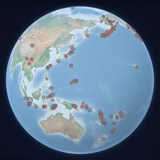
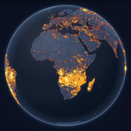
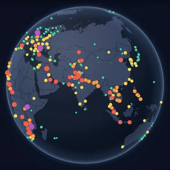
Each dot is a station that has reported in the past six hours, coloured by its PM2.5 level in micrograms per cubic metre. Where there are no dots, nobody is sharing measurements — much of Africa and Central Asia — and the map leaves them empty rather than guessing.
How to read it
- Green is clean air; yellow, orange, red and purple are ever higher PM2.5.
- The World Health Organization's guideline is 5 µg/m³ as a yearly average and 15 µg/m³ over a day.
- A single high dot can be a local source or a faulty sensor; look at its neighbours.
Where the data comes from
OpenAQ (measured PM2.5 from official and low-cost monitors that share their data openly), readings no older than six hours, refreshed every fifteen minutes while the layer is open.
Questions
- What is PM2.5?
- Particles smaller than 2.5 micrometres — about a thirtieth of a hair's width — from traffic, heating, industry, fires and dust. They reach deep into the lungs and the blood, which is why they are the pollutant most closely watched for health.
- Where is the air worst right now?
- The highest readings usually come from South Asia, parts of China, the Middle East and West Africa, and from wherever a large fire or a dust storm is blowing smoke over cities.
- Why is my country empty on the map?
- The map shows only real measurements that are shared openly. Where no station reports, or reports only old readings, nothing is drawn — an honest gap instead of a modelled guess.