 On a Mercator mapAt its true size
True size, side by side
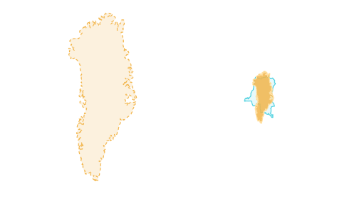
Every country on an equal-area map. Lay one over another anywhere on Earth and its area never changes: Greenland over DR Congo is as big in Africa as in the Arctic.
Android may ask you to allow installs from your browser once.
Kartavera is an atlas that draws every country at its true size. The map above uses the Equal Earth projection, where a square kilometre in Greenland takes exactly as much screen as one in Congo. Pick any country, drag it anywhere on the world, and compare it with what it lands on. Slide the map back to Mercator to see how much your usual map has been lying.
There is an Android app →A daily puzzle the whole world shares, a pentathlon of five games in one, live duels against a stranger or a friend, and practice for whatever you want to learn. All of it fills one passport.
All games →Other tools show you that Greenland is smaller than it looks. Kartavera shows you by how much, why, and how well you know the world.
Watch the 20-second tourOn a Mercator mapAt its true sizeEvery country on an equal-area map. Lay one over another anywhere on Earth and its area never changes: Greenland over DR Congo is as big in Africa as in the Arctic.
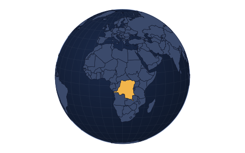
Slide one map from Mercator through Equal Earth to a globe of the real Earth, and watch the distortion melt away.
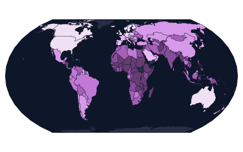
Colour the world by population, income, life expectancy, internet use, forests, CO₂ or government, find countries by typing a question, and open the ranking behind any figure.
A daily round, practice that brings back what you missed, Flag Rush, duels, weekly leagues, and a passport that fills with every country you get right.
Every page, name, number and game in English, Spanish, Portuguese, German, French and Serbian.
Earthquakes as they happen, clouds from satellites, fires, the air, and the Moon and planets where they are today — on the same true-size map.
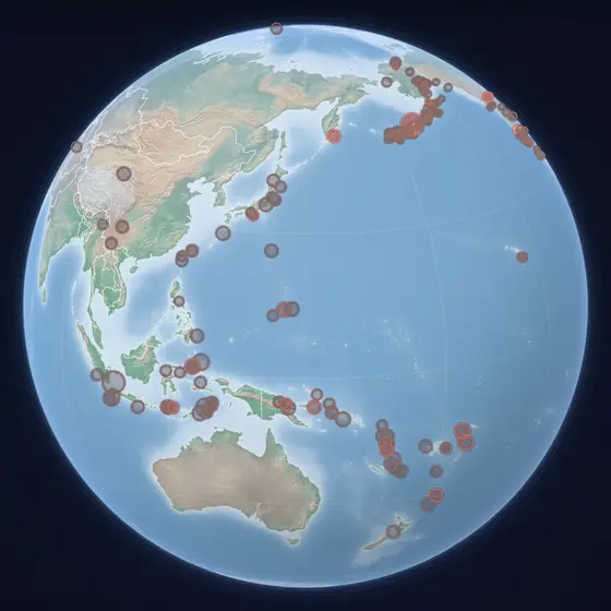 Earthquakes● LiveEvery tremor from magnitude 2.5, as it happensOpen →
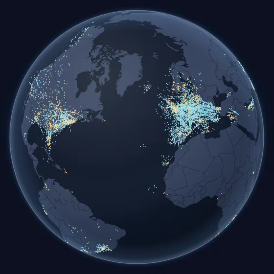 Flights● LiveEvery aircraft in the air, moving as it fliesOpen →
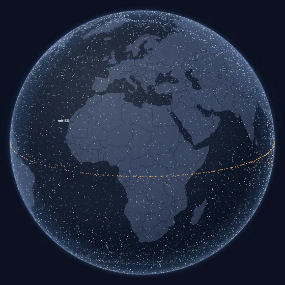 Satellites● LiveEvery active satellite, where it is this secondOpen →
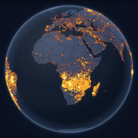 Fires● LiveSeen by satellites in the past 24 hoursOpen →
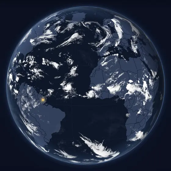 Clouds and night● LiveThe sky from satellites, and where night isOpen →
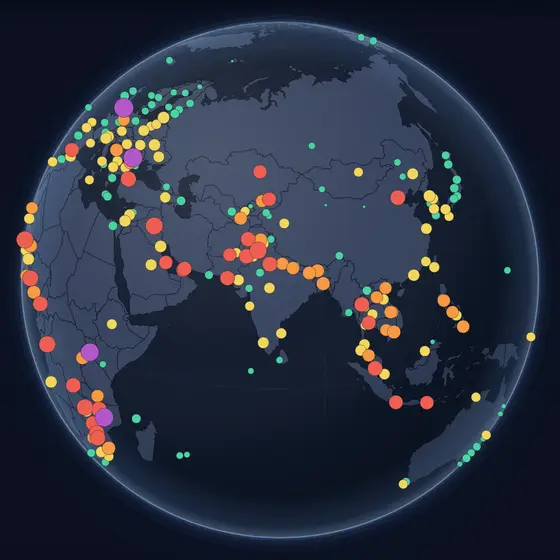 Air quality● LivePM2.5 where someone is measuring itOpen →
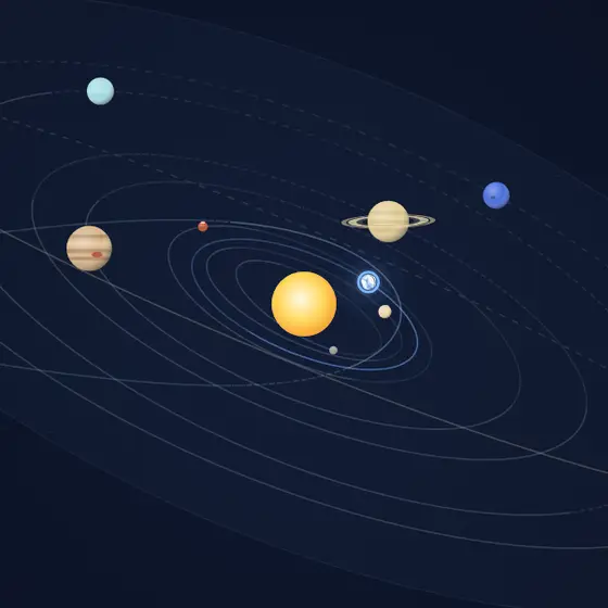 The Solar SystemEvery planet where it is right nowOpen →
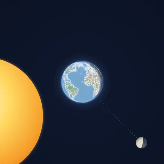 The Earth and the MoonIts phase, distance and the next eclipsesOpen →
Gerardus Mercator drew his map in 1569 so that a ship's compass course would be a straight line. To do that he had to stretch the world more and more toward the poles. Greenland ends up looking like Africa; in reality Africa is fourteen times larger. The projection was never meant for comparing countries, yet it is the one on nearly every screen.
Equal Earth, published in 2018, keeps areas exact and continents recognisable. Kartavera uses it for the world map, and when you drag a country across the map it rotates the whole sphere underneath, so the country's area cannot change, not even by a pixel. The numbers beside the map come from Natural Earth, Wikidata and the World Bank, each with its year and source.