Ethiopia vs South Africa
South Africa is 11% larger than Ethiopia.
EthiopiaSouth AfricaEthiopia moved onto South Africa · Equal-area projection
0.9×
Ethiopia is 0.9× the area of South Africa. Put the other way, South Africa is 1.11× the size of Ethiopia.
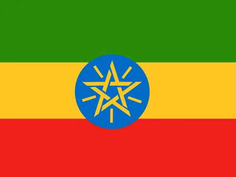 Ethiopia Ethiopia | 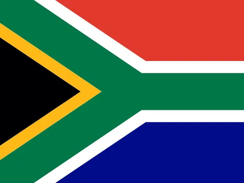 South Africa South Africa | |
|---|---|---|
| Size | ||
| AreaSouth Africa: 1.11× the area | 1,104,300 km²#26 of 194 | 1,221,037 km²#24 of 194 |
| Coastline | Landlocked | Has a coast |
| Land neighbours | 6 | 6 |
| People | ||
| PopulationEthiopia: 2.09× the population | 135,472,051#10 of 194 · 2025 | 64,747,319#24 of 194 · 2025 |
| DensityEthiopia: 2.31× the density | 123 / km²#73 of 194 | 53 / km²#132 of 194 |
| Urban populationSouth Africa: 2.65× the urban share | 24%#182 of 192 · 2025 | 64%#93 of 192 · 2025 |
| Fertility rateEthiopia: 1.77× the births per woman | 3.91 per woman#26 of 192 · 2024 | 2.21 per woman#86 of 192 · 2024 |
| Population growthEthiopia: 1.40 points higher | +2.55%#24 of 192 · 2025 | +1.15%#89 of 192 · 2025 |
| Birth rateEthiopia: 1.7× the birth rate | 31.5 per 1,000#24 of 192 · 2024 | 18.5 per 1,000#81 of 192 · 2024 |
| Death rateSouth Africa: 1.56× the death rate | 5.9 per 1,000#144 of 192 · 2024 | 9.2 per 1,000#50 of 192 · 2024 |
| Children under 15Ethiopia: 13.1 points higher | 38.8%#30 of 192 · 2025 | 25.7%#87 of 192 · 2025 |
| People over 65South Africa: 3.6 points higher | 3.3%#158 of 192 · 2025 | 6.9%#102 of 192 · 2025 |
| Net migrationSouth Africa: 2.1 per 1,000 higher | +0.2 per 1,000#68 of 192 · 2025 | +2.3 per 1,000#36 of 192 · 2025 |
| Refugees abroadEthiopia: 60.5× the refugees for its size | 1.21 per 1,000#54 of 190 · 2025 | 0.02 per 1,000#145 of 190 · 2025 |
| Health & education | ||
| Life expectancyEthiopia: 1.3 years longer | 67.6 years#146 of 192 · 2024 | 66.3 years#158 of 192 · 2024 |
| Infant mortalityEthiopia: 1.43× the infant mortality | 34.5 per 1,000 births#36 of 191 · 2024 | 24.2 per 1,000 births#58 of 191 · 2024 |
| DoctorsSouth Africa: 5.64× the doctors per person | 0.14 per 1,000#161 of 178 · 2023 | 0.79 per 1,000#111 of 178 · 2022 |
| University enrolment | — | 23.5%#109 of 145 · 2023 |
| Human Development IndexSouth Africa: 0.244 higher | 0.497#177 of 190 · 2023 | 0.741#105 of 190 · 2023 |
| Economy | ||
| GNI per capitaSouth Africa: 5.65× the income per person | $1,110#168 of 185 · 2025 | $6,270#101 of 185 · 2025 |
| GDPSouth Africa: 3.38× the economy | $126.36B2025 | $427.18B2025 |
| Income group | Low income | Upper-middle income |
| GDP per capita (PPP)South Africa: 4.39× the output per person | $3,622#165 of 184 · 2025 | $15,906#107 of 184 · 2025 |
| GDP growthEthiopia: 8.7 points higher | +9.8%#5 of 187 · 2025 | +1.1%#152 of 187 · 2025 |
| InflationEthiopia: 10.0 points higher | +13.2%#17 of 176 · 2025 | +3.2%#86 of 176 · 2025 |
| UnemploymentSouth Africa: 9.82× the unemployment | 3.3%#127 of 178 · 2025 | 32.4%#2 of 178 · 2025 |
| Extreme povertyEthiopia: 2.22× the share in extreme poverty | 38.6%#23 of 149 · 2021 | 17.4%#39 of 149 · 2022 |
| Income inequality (Gini)South Africa: 23.0 higher | 31.1#110 of 149 · 2021 | 54.1#5 of 149 · 2022 |
| Jobs in agricultureEthiopia: 54.7 points higher | 60.1% of jobs#14 of 178 · 2025 | 5.4% of jobs#128 of 178 · 2025 |
| Jobs in industrySouth Africa: 14.4 points higher | 6.4% of jobs#174 of 178 · 2025 | 20.8% of jobs#71 of 178 · 2025 |
| Jobs in servicesSouth Africa: 40.4 points higher | 33.4% of jobs#161 of 178 · 2025 | 73.8% of jobs#35 of 178 · 2025 |
| Foreign investmentEthiopia: 3.5 points higher | 3.0% of GDP#65 of 184 · 2025 | -0.5% of GDP#171 of 184 · 2025 |
| ExportsSouth Africa: 18.1 points higher | 13.3% of GDP#153 of 168 · 2025 | 31.4% of GDP#98 of 168 · 2025 |
| Military spendingSouth Africa: 1.51× the military spending | 0.5% of GDP#144 of 155 · 2025 | 0.7% of GDP#132 of 155 · 2025 |
| Internet usersSouth Africa: 3.58× the share online | 22%#171 of 184 · 2024 | 78%#101 of 184 · 2024 |
| Mobile subscriptionsSouth Africa: 2.75× the mobile subscriptions | 65 per 100#167 of 191 · 2024 | 179 per 100#7 of 191 · 2024 |
| Energy & environment | ||
| Forest areaEthiopia: 1.27× the forest share | 24% of land#113 of 192 · 2024 | 19% of land#123 of 192 · 2024 |
| CO₂ per personSouth Africa: 45.9× the CO₂ per person | 0.15 t a year#174 of 185 · 2024 | 6.88 t a year#33 of 185 · 2024 |
| Renewable energyEthiopia: 80.9 points higher | 90.6%#7 of 190 · 2021 | 9.7%#143 of 190 · 2021 |
| Access to electricitySouth Africa: 33.6 points higher | 56.6%#167 of 192 · 2024 | 90.2%#138 of 192 · 2024 |
| Air pollution (PM2.5)South Africa: 1.16× the air pollution | 23.8 µg/m³#63 of 191 · 2023 | 27.7 µg/m³#55 of 191 · 2023 |
| Protected landEthiopia: 7.4 points higher | 17.0% of land#100 of 191 · 2025 | 9.6% of land#143 of 191 · 2025 |
| Arable landEthiopia: 4.7 points higher | 14.6% of land#75 of 190 · 2024 | 9.9% of land#102 of 190 · 2024 |
| Water stressSouth Africa: 2.09× the water stress | 32.3%#52 of 176 · 2022 | 67.6%#26 of 176 · 2022 |
| PrecipitationEthiopia: 1.71× the rain and snow | 848 mm#101 of 180 · 2022 | 495 mm#143 of 180 · 2022 |
| Governance & safety | ||
| Political stabilitySouth Africa: 1.47 higher | −1.85#183 of 193 · 2025 | −0.38#129 of 193 · 2025 |
| Control of corruptionSouth Africa: 0.24 higher | −0.37#108 of 193 · 2025 | −0.13#87 of 193 · 2025 |
| Homicide rate | — | 43.7 per 100,000#5 of 146 · 2022 |
| State | ||
| Status | Independent state | Independent state |
| Government | Parliamentary republicfederal parliamentary republic | Parliamentary republic |
| Member of | BRICS | G20, BRICS |
| Capital | Addis Ababa | Pretoria |
| Currency | Ethiopian birr (ETB) | South African rand (ZAR) |
| Official languages | Amharic | English, Afrikaans, Zulu, Xhosa, Sesotho, Tswana, Swazi, Tsonga, Venda, Northern Sotho, Southern Ndebele, South African Sign Language |
| Traffic drives | On the right | On the left |
| Time zone | UTC+3 | UTC+2 |
| Calling code | +251 | +27 |
| Region | Eastern Africa, Africa | Southern Africa, Africa |
Area: Wikidata. Population, income, health, economy, environment and governance: World Bank. Human Development Index: UNDP. Government: CIA World Factbook. Ranks among the 194 independent states. All sources
Why the map you grew up with disagrees
On a Mercator map, area grows with distance from the equator. Ethiopia sits at about 9° N and is stretched to 1.02× its true area; South Africa at 29° S is stretched to 1.31×. Here the two are distorted about the same amount, so Mercator gets this pair roughly right. The figure above uses the Equal Earth projection, where every square kilometre is drawn the same size.
Questions about this pair
- Is Ethiopia bigger than South Africa?
- No. Ethiopia is 10% smaller than South Africa. Ethiopia covers 1,104,300 km² and South Africa covers 1,221,037 km².
- How many times does Ethiopia fit into South Africa?
- About 1.1 times: South Africa has 1.11× the area of Ethiopia.
- Why do Ethiopia and South Africa look different on Google Maps?
- Web maps use the Mercator projection, which stretches area with distance from the equator. Ethiopia is drawn about 1.02× its true area there and South Africa about 1.31×. For this pair the distortion is similar, so Mercator gets the comparison roughly right. Kartavera uses Equal Earth, where every square kilometre is drawn the same size.
- Which has more people, Ethiopia or South Africa?
- Ethiopia: 135,472,051 people against 64,747,319. Density: Ethiopia 123 per km², South Africa 53 per km².
- Which is richer, Ethiopia or South Africa?
- By gross national income per person, South Africa: $6,270 against $1,110 (World Bank, Atlas method, 2025) — 5.65× as much.
- Where do people live longer, Ethiopia or South Africa?
- In Ethiopia: life expectancy at birth is 67.6 years, against 66.3 — 1.3 years longer (World Bank, 2024).
- What kind of government do Ethiopia and South Africa have?
- The same form of government, by constitution: parliamentary republic (CIA World Factbook).