Micronesia vs São Tomé and Principe
São Tomé and Principe is 43% larger than Micronesia.
MicronesiaSão Tomé and PrincipeMicronesia moved onto São Tomé and Principe · Equal-area projection
Remote islands and overseas parts not drawn; the figures include them
0.7×
Micronesia is 0.7× the area of São Tomé and Principe. Put the other way, São Tomé and Principe is 1.43× the size of Micronesia.
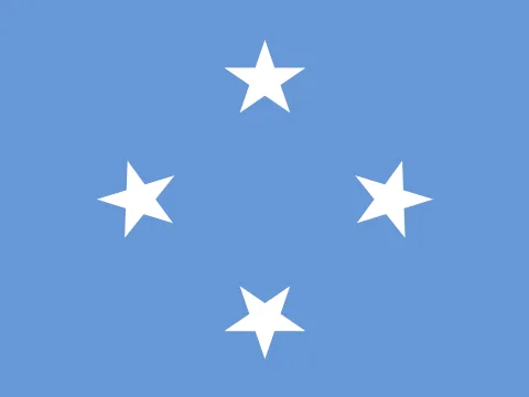 Micronesia Micronesia | 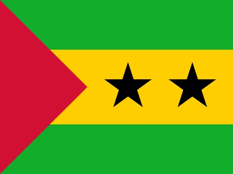 São Tomé and Principe São Tomé and Principe | |
|---|---|---|
| Size | ||
| AreaSão Tomé and Principe: 1.43× the area | 702 km²#177 of 194 | 1,001 km²#171 of 194 |
| Coastline | Coast, no land border | Coast, no land border |
| Land neighbours | 0 | 0 |
| People | ||
| PopulationSão Tomé and Principe: 2.11× the population | 113,683#181 of 194 · 2025 | 240,254#175 of 194 · 2025 |
| DensitySão Tomé and Principe: 1.48× the density | 162 / km²#57 of 194 | 240 / km²#42 of 194 |
| Urban populationSão Tomé and Principe: 3.08× the urban share | 23%#183 of 192 · 2025 | 69%#78 of 192 · 2025 |
| Fertility rateSão Tomé and Principe: 1.31× the births per woman | 2.74 per woman#58 of 192 · 2024 | 3.60 per woman#39 of 192 · 2024 |
| Population growthSão Tomé and Principe: 1.52 points higher | +0.46%#131 of 192 · 2025 | +1.98%#49 of 192 · 2025 |
| Birth rateSão Tomé and Principe: 1.26× the birth rate | 22.3 per 1,000#59 of 192 · 2024 | 28.1 per 1,000#38 of 192 · 2024 |
| Death rateMicronesia: 1.4× the death rate | 7.7 per 1,000#79 of 192 · 2024 | 5.5 per 1,000#156 of 192 · 2024 |
| Children under 15São Tomé and Principe: 6.0 points higher | 31.5%#62 of 192 · 2025 | 37.5%#38 of 192 · 2025 |
| People over 65Micronesia: 2.3 points higher | 6.2%#111 of 192 · 2025 | 3.9%#144 of 192 · 2025 |
| Net migrationSão Tomé and Principe: 7.2 per 1,000 higher | −9.9 per 1,000#182 of 192 · 2025 | −2.7 per 1,000#156 of 192 · 2025 |
| Refugees abroad | 0.00 per 1,000#174 of 190 · 2025 | 0.03 per 1,000#138 of 190 · 2025 |
| Health & education | ||
| Life expectancySão Tomé and Principe: 2.5 years longer | 67.4 years#150 of 192 · 2024 | 69.9 years#131 of 192 · 2024 |
| Infant mortalityMicronesia: 2.21× the infant mortality | 20.3 per 1,000 births#68 of 191 · 2024 | 9.2 per 1,000 births#114 of 191 · 2024 |
| DoctorsMicronesia: 2.11× the doctors per person | 0.97 per 1,000#110 of 178 · 2020 | 0.46 per 1,000#130 of 178 · 2022 |
| Human Development IndexSão Tomé and Principe: 0.022 higher | 0.615#146 of 190 · 2023 | 0.637#138 of 190 · 2023 |
| Economy | ||
| GNI per capitaMicronesia: 1.25× the income per person | $4,760#116 of 185 · 2025 | $3,800#128 of 185 · 2025 |
| GDPSão Tomé and Principe: 1.95× the economy | $502M2025 | $981M2025 |
| Income group | Upper-middle income | Lower-middle income |
| GDP per capita (PPP)São Tomé and Principe: 1.39× the output per person | $4,604#155 of 184 · 2025 | $6,388#144 of 184 · 2025 |
| GDP growthMicronesia: 0.1 points higher | +1.1%#152 of 187 · 2025 | +1.0%#156 of 187 · 2025 |
| InflationSão Tomé and Principe: 5.6 points higher | +5.4%#39 of 176 · 2022 | +11.0%#21 of 176 · 2025 |
| Unemployment | — | 9.1%#40 of 178 · 2025 |
| Extreme poverty | — | 13.0%#42 of 149 · 2017 |
| Income inequality (Gini) | — | 40.7#33 of 149 · 2017 |
| Jobs in agriculture | — | 12.1% of jobs#102 of 178 · 2025 |
| Jobs in industry | — | 22.5% of jobs#59 of 178 · 2025 |
| Jobs in services | — | 65.4% of jobs#68 of 178 · 2025 |
| Foreign investment | — | 10.5% of GDP#15 of 184 · 2025 |
| ExportsMicronesia: 8.8 points higher | 22.1% of GDP#124 of 168 · 2025 | 13.3% of GDP#153 of 168 · 2025 |
| Internet usersSão Tomé and Principe: 1.5× the share online | 40%#155 of 184 · 2024 | 59%#136 of 184 · 2024 |
| Mobile subscriptionsSão Tomé and Principe: 3.1× the mobile subscriptions | 20 per 100#191 of 191 · 2022 | 62 per 100#171 of 191 · 2024 |
| Energy & environment | ||
| Forest areaMicronesia: 1.6× the forest share | 92% of land#1 of 192 · 2024 | 58% of land#33 of 192 · 2024 |
| CO₂ per person | 0.00 t a year#183 of 185 · 2024 | 0.63 t a year#142 of 185 · 2024 |
| Renewable energySão Tomé and Principe: 40.5 points higher | 2.0%#166 of 190 · 2022 | 42.5%#56 of 190 · 2022 |
| Access to electricityMicronesia: 11.2 points higher | 88.9%#141 of 192 · 2024 | 77.7%#149 of 192 · 2024 |
| Air pollution (PM2.5)São Tomé and Principe: 4.31× the air pollution | 3.5 µg/m³#191 of 191 · 2023 | 15.1 µg/m³#115 of 191 · 2023 |
| Protected landSão Tomé and Principe: 31.7 points higher | 0.0% of land#188 of 191 · 2025 | 31.7% of land#27 of 191 · 2025 |
| Arable landSão Tomé and Principe: 0.8 points higher | 3.4% of land#145 of 190 · 2024 | 4.2% of land#135 of 190 · 2024 |
| Water stress | — | 1.9%#149 of 176 · 2022 |
| Precipitation | — | 3,200 mm#2 of 180 · 2022 |
| Governance & safety | ||
| Political stabilityMicronesia: 0.97 higher | +1.52#3 of 193 · 2025 | +0.55#65 of 193 · 2025 |
| Control of corruptionMicronesia: 0.54 higher | +0.67#47 of 193 · 2025 | +0.13#75 of 193 · 2025 |
| Homicide rate | 0.9 per 100,000#110 of 146 · 2019 | — |
| State | ||
| Status | Independent state | Independent state |
| Government | Parliamentary republicfederal republic in free association with the US | Semi-presidential republic |
| Capital | Palikir | Sao Tome |
| Currency | United States dollar (USD) | São Tomé and Príncipe dobra (STN) |
| Official languages | English | Portuguese |
| Traffic drives | On the right | On the right |
| Time zone | UTC+11 · UTC+10 to UTC+11, 2 time zones | UTC |
| Calling code | +691 | +239 |
| Region | Micronesia, Oceania | Middle Africa, Africa |
Area: Wikidata. Population, income, health, economy, environment and governance: World Bank. Human Development Index: UNDP. Government: CIA World Factbook. Ranks among the 194 independent states. All sources
Why the map you grew up with disagrees
On a Mercator map, area grows with distance from the equator. Micronesia sits at about 8° N and is stretched to 1.02× its true area; São Tomé and Principe at 0° N is stretched to 1.0×. Here the two are distorted about the same amount, so Mercator gets this pair roughly right. The figure above uses the Equal Earth projection, where every square kilometre is drawn the same size.
Questions about this pair
- Is Micronesia bigger than São Tomé and Principe?
- No. Micronesia is 30% smaller than São Tomé and Principe. Micronesia covers 702 km² and São Tomé and Principe covers 1,001 km².
- How many times does Micronesia fit into São Tomé and Principe?
- About 1.4 times: São Tomé and Principe has 1.43× the area of Micronesia.
- Why do Micronesia and São Tomé and Principe look different on Google Maps?
- Web maps use the Mercator projection, which stretches area with distance from the equator. Micronesia is drawn about 1.02× its true area there and São Tomé and Principe about 1.0×. For this pair the distortion is similar, so Mercator gets the comparison roughly right. Kartavera uses Equal Earth, where every square kilometre is drawn the same size.
- Which has more people, Micronesia or São Tomé and Principe?
- São Tomé and Principe: 240,254 people against 113,683. Density: Micronesia 162 per km², São Tomé and Principe 240 per km².
- Which is richer, Micronesia or São Tomé and Principe?
- By gross national income per person, Micronesia: $4,760 against $3,800 (World Bank, Atlas method, 2025) — 1.25× as much.
- Where do people live longer, Micronesia or São Tomé and Principe?
- In São Tomé and Principe: life expectancy at birth is 69.9 years, against 67.4 — 2.5 years longer (World Bank, 2024).
- What kind of government do Micronesia and São Tomé and Principe have?
- By constitution, as the CIA World Factbook describes them — Micronesia: parliamentary republic; São Tomé and Principe: semi-presidential republic.